In this forum I post the changes on the DEVELOPER version of the game.
These versions are (at the time i post them) not yet published to google play, only registered testers can download it and test it before publishing.
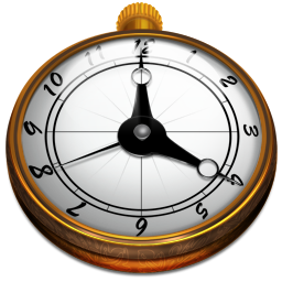
That's cool, that perspective make it looks very 3D'sh, but it got a bit blurried on top numbers on the resized version, i think the one Hyancintho made is simple and more evident... Perhaps mixing both, picking the one Hyancintho made and give the deepth of this one would make the best combination.
That clock looks nice, but i think would be better to use it to make a building or two for the game. Maybe it can be used to make a church or that british Big Ben. (It with Westminster palace as 2x2 would be very, very cool)
You know, looking at these, I'm pretty sure those pictures would be right at home in the game. I don't have the skill neccessary to make a 3D pocket watch image, and no time to learn. Besides, I'm planning on officially retiring from the forum soon, and I would like to see this topic finished fast.
I'll modify the animation above, give it some team coloring. While the numbers on the resized version of the next turn button are blurred, I don't believe it really matters. People will see a clock, and that is exactly what they should see, numbers being a cool, but unnecessary feature.
My last project here is going to be the "stand your ground" button, which I do plan to finish. However, I'm struggling to choose the design, should it be a shield or a detailed hand in a "HALT" position, like the current image only better?