Page 2 of 2
Re: In game - UI redesign
Posted: Wed Feb 06, 2019 10:07 pm
by Stratego (dev)
sure, forget the backpack, we can put there any icon, i just thew that there (in that pack i used there was nothing better)
same true for the + and - for zoom, i just have yet found nice + and - yet
i still want them to be hideable as well as to see in game amount of units, buildings and castles i have as well as current turn without coming into menu
ok , where would u put it - could u draw similar sample image as i do? (i do it with a simple Gimp image manipulator app)
Re: In game - UI redesign
Posted: Wed Feb 06, 2019 10:09 pm
by Stratego (dev)
action button in new place

Re: In game - UI redesign
Posted: Wed Feb 06, 2019 11:04 pm
by Alexander82
Maybe a simple arrow or an hourglass for the next turn
Re: In game - UI redesign
Posted: Wed Feb 06, 2019 11:09 pm
by Stratego (dev)
yep
Re: In game - UI redesign
Posted: Wed Feb 06, 2019 11:52 pm
by Wallenstein
Stratego (dev) wrote: ↑Wed Feb 06, 2019 10:09 pm
action button in new place
this looks really really cool!
Re: In game - UI redesign
Posted: Thu Feb 07, 2019 5:06 am
by makazuwr32
@Stratego (dev)
1. Bottom right till the bottom middle is used by unit spells so i think it is bad placement.
2. I am bad at drawing in the first place.
3. Where did you place that star button near zoom buttons?
4. I want hiding option to be in that star button.
5.
makazuwr32 wrote: ↑Wed Feb 06, 2019 10:58 am
On second thought i think i know what improvements i want to see:
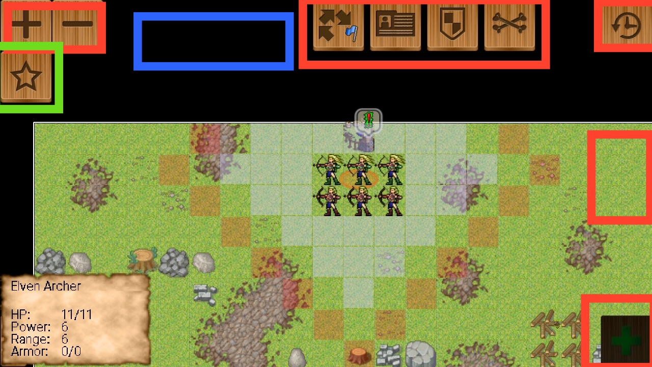
1. I want to add into green openable button another button that will hide and show all red buttons.
2. Lower all buttons exept of 3 dot menu size by 15-25%
3. Add to blue field general stats: amount of buildings, castles, current turn. All info from red field in next screenshot. Also i want it to be showable and hideable like everything else.
4. In normal settings you can choose which buttons you want to be always showable.
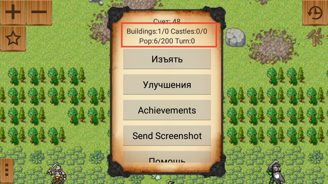
Also maybe instead of separating buttons try to make a full line of menu buttons on top of screen?
Re: In game - UI redesign
Posted: Thu Feb 07, 2019 7:19 am
by Stratego (dev)
Look relevant things:
2. Lower all buttons exept of 3 dot menu size by 15-25%
ok, this is about to i think (little circles - if they will bechosen) alreadyy smaller
3. Add to blue field general stats: amount of buildings, castles, current turn. All info from red field in next screenshot. Also i want it to be showable and hideable like everything else.
good! any idea how this should look? i would love some image samples if u can make/find some
1. Bottom right till the bottom middle is used by unit spells so i think it is bad placement.
you are right, i thought those could go elsewhere like vertically under next turn button - but maybe we can get back with them to the top of the screen.
2. I am bad at drawing in the first place.
no problem, me too

but we can look for free "GUI design"-s to start from on the interenet.
3. Where did you place that star button near zoom buttons?
it would be undessr + - button as before, unless u suggest something else - eg. bottom left?
Also maybe instead of separating buttons try to make a full line of menu buttons on top of screen?
i saw it is not fancy nowadays - or even in mobile - so i think we should stick to these separate button or only "islands" of buttons
Logic relevant things:
1. I want to add into green openable button another button that will hide and show all red buttons. 4. I want hiding option to be in that star button.
is it necessary? i think will not really help in xtending the view, and eventually u need all buttons (eg. next turn) - maybe thezoom can be swithable but that is also small part of the view.
4. In normal settings you can choose which buttons you want to be always showable.
i think it would over configurable.
Re: In game - UI redesign
Posted: Thu Feb 07, 2019 7:21 am
by Stratego (dev)
question: which is better direction in terms of button background (so dont look at icons and alignment, only button style):
A:

B:

C:
something else?
Re: In game - UI redesign
Posted: Thu Feb 07, 2019 7:32 am
by makazuwr32
I like more A.
Also i want that hiding buttons ability to better planning movement and making better screenshots with minimal UI
Re: In game - UI redesign
Posted: Thu Feb 07, 2019 9:13 am
by Stratego (dev)
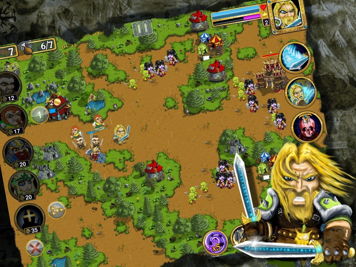
next i like:
Re: In game - UI redesign
Posted: Thu Feb 07, 2019 9:26 am
by Stratego (dev)
and this:

Re: In game - UI redesign
Posted: Thu Feb 07, 2019 12:39 pm
by Stratego (dev)
ok, here we are now with the plan

Re: In game - UI redesign
Posted: Thu Feb 07, 2019 1:31 pm
by makazuwr32
This looks so much better than both original design we have for now and all previous variants.
But please make 2 buttons in the top middle of the same size as others.
Re: In game - UI redesign
Posted: Thu Feb 07, 2019 2:29 pm
by Stratego (dev)
those bigger buttons are intentional - looks better imho, and the most used buttons to be bigger and little different.
(i even thought the selected "spell" also being bigger not only blue)
Re: In game - UI redesign
Posted: Thu Feb 07, 2019 2:50 pm
by makazuwr32
Most used button is in top right corner.
That "move to the point" button is least usable for me. Only on uncontrollable by any other means green dragons of orcs i use it.
Stop unit is also situational button.
Can you add option to disable some buttons? Like in my case "moving to the point" one.
Re: In game - UI redesign
Posted: Thu Feb 07, 2019 4:11 pm
by Dagravian
Stratego (dev) wrote: ↑Thu Feb 07, 2019 12:39 pm
ok, here we are now with the plan
This is looking nice, also for aof, we could use those buttons as base and make variants for every race.
- Stone with interlaced vines as borders for humans.
- Wood with interlaced vines for elves.
- This same one for orcs and scalefolk but with more tribal icons.
- Stone with metal borders for dwarfs.
- Darker Stone with moss borders... Also maybe we can make a Bone Snake as border, would look nice aswell...
Re: In game - UI redesign
Posted: Thu Feb 07, 2019 4:18 pm
by Field marshal Mick
I think the buttons are great as is. But if you must make a change. Then perhaps a hexagon with a dark background? I noticed that most of the examples for new ones did not stand out from the map very well.
Re: In game - UI redesign
Posted: Thu Feb 07, 2019 4:24 pm
by Stratego (dev)
DoomsdayDragonfire wrote: ↑Thu Feb 07, 2019 4:11 pm
Stratego (dev) wrote: ↑Thu Feb 07, 2019 12:39 pm
ok, here we are now with the plan
This is looking nice, also for aof, we could use those buttons as base and make variants for every race.
- Stone with interlaced vines as borders for humans.
- Wood with interlaced vines for elves.
- This same one for orcs and scalefolk but with more tribal icons.
- Stone with metal borders for dwarfs.
- Darker Stone with moss borders... Also maybe we can make a Bone Snake as border, would look nice aswell...
oh no
no race dependency
but you can vote for it in a separate topic. it can be implemented sometime